Redesigning and developing UMD website
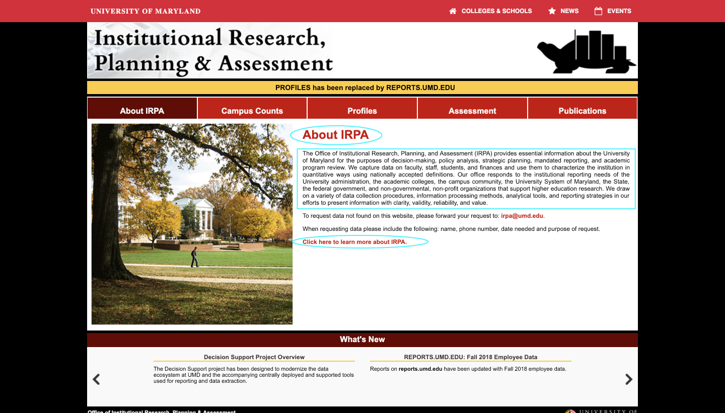
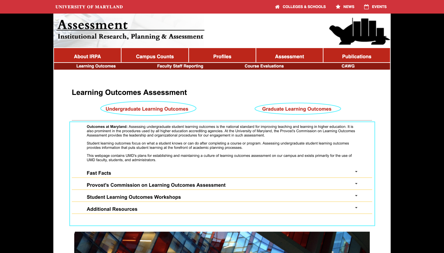
As the Lead UX Researcher & Designer, I developed a university-wide website to serve a minimum 50K user base. The original website didn’t meet the Web Content Accessibility Guidelines and lacked visual appeal. I redesigned and developed it to be responsive across all platforms, cross-browser compatible, improved the accessibility score from 66% to 98%, and reduced the number of clicks needed to access the required information by 75%. Here’s the new website I developed.
My Role: UX Research & Design, Prototyping and Evaluation, Front-end Website Development
Duration: 1 year
Tools Used: Axure RP, Google Analytics, UserZoom
Techniques Used: User Interviews, Stakeholder Interviews, Competitor Analysis, Usability Testing, Card Sorting, Statistical Analysis using UserZoom, Quantitative Research using Google Analytics, Heuristic Evaluation, Empathy Mapping, Persona Creation, and User Journey Mapping.
Languages Used: HTML5, CSS3, JavaScript, Bootstrap framework
The Who and The Why?
The Office of Institutional Research Planning and Assessment (IRPA) website didn’t meet the Web Content Accessibility Guidelines and had to be redesigned to provide it with a modern look and feel, better user experience, and meet the accessibility guidelines.
The primary users of the website are Deans, Vice-President, Assistant to university leadership, and many other staff members who want quick access to the information. To assess the areas that need to be improved, I conducted extensive user research, which helped me in driving the design decisions.
The How?
Design Process
My design process included an iterative approach and was majorly divided into 3 phases: research, design, and website development. Starting the process with my users and using both quantitative and qualitative techniques, helped me in understanding that although the stakeholders wanted a modern look and feel to the website, the users wanted a better structure and organization of the website content. So my efforts were inclined more towards improving the information architecture of the website while simultaneously improving its visual appeal.
PHASE 1: RESEARCHThrough user research, some of the questions I wanted to understand: Who is my user?, what are their challenges with the current experience?, are we meeting the standards set by other universities?, how can we improve?
Competitive analysis
Analyzed 30 Institutional Research websites across different universities to find their strengths and weaknesses. They were assessed on 17 parameters like if the information was present on staff directory; if they contained visualizations, were mobile-friendly; and what was their technology-stack. I have highlighted 2 of such websites below:
The University of North Carolina at Chapel Hill site has stats present in the form of a slideshow which transitions automatically but it lacks controls for switching between slides.
The Georgia College website was ranked 1st in the list of Best IR Websites 2016. However, the content for drop downs are long and hard to skim through, increasing the cognitive load.
Quantitative Analysis
I used Google Analytics to analyze the traffic, the first page visited, clicks and paths, navigation pattern, drop out rate, and engagement rate. On an average, users spend only 3 minutes on the site and use it on Chrome on Windows desktop. Additionally, most mobile users had a screen resolution of iPhone 6-8. This information will be helpful while developing the website and making it responsive across all platforms. 83% of the users were new visitors and 33% of the users were from College Park. Here are some of the screenshots of the web analytics:
Top pages visited: Campus Counts, Common Datasets, Reports.
On an average, users visit 3 pages spending around 3mins.
33% of the users were from College Park.
Heuristic Evaluation
The website was analyzed against 90 parameters such as visibility of system status, consistency and standards, and aesthetic design. It helped me in identifying usability problems with the website, for example, it is hard for the user to differentiate between what’s clickable and what’s not, as links and titles use the same color, and links are also not underlined.
PHASE 2: EMPATHIZEI interviewed users, stakeholders, and support staff in a semi-structured format. This helped me in learning more about their pain points. Here’s a summary:
Stakeholder Interviews
I interviewed 14 stakeholders. 53% of the people use the website frequently to look up something. 57% people wanted the look and feel of the website to be improved, while 64% people want fewer clicks to access the content on the website.
User Interviews
I interviewed 8 primary users. 75% users have been using the site for more than 5 years for looking up campus related facts. 62% users felt the website needs not just the modern look and feel, but also better structure and organization of content, providing quick access to data.
Support Staff Interviews
I interviewed 2 members from the support team and found that out of all the requests that they receive, 85% times the information is already present on the website and the rest 15% times it is related to the data that the department does not collect or is publicly unavailable.
Empathy Map
After learning about the user challenges, I created empathy map to define different user types:
Primary users: Employees at UMD who have been using the website for a long time, making them very familiar with the interface. They want quick access to the information and they reach out to the IRPA staff members whenever they are unable to find something.
Secondary users: Support staff at IRPA who use the site occasionally, provide technical support to the users, and handle data requests.
Tertiary users: New visitors to the site for example, college students and their family members and university professors.
Persona
The project focuses on the primary and tertiary users because the needs of the primary users hold the most importance and it is their expectations that this project will try to meet. However, it was also important to engage tertiary users (new visitors), as their opinions and perceptions could determine the success or failure of this project. So I created the following personas:
User Journey Maps
I created 2 user journey maps for the 2 personas, which helped me in visualizing the user pain points throughout the experience.
PHASE 3: DEFINEUsability Testing
I conducted remote unmoderated usability tests with 4 primary users and 1 tertiary user, through UserZoom and “think-out-loud” protocol. They had to perform 5 tasks with varying difficulty levels, and answer a post-test questionnaire. This helped me in evaluating their task comfort level, understanding the pain points, and focus on what users did rather than what they said. I also learned that people have a hard time in finding information they are not familiar with, implying that the website is not intuitive and users have adapted themselves to the everyday navigation patterns.
Here is a summary of the results obtained from the usability test:

Card Sorting
One of the areas that the website needed improvement was its poor information architecture. To accomplish this, I conducted remote open card sorting exercise with 60 users and 29 cards using UserZoom. They were asked to group the content according to their best understanding and label it according to what they feel should be the best term for each group. This helped me in understanding how do users perceive the content, and what would be the best way to organize and structure it on the website in their opinion.
Utilizing card sorting results to build the sitemap and identify the best strategy to organize the content
Following the card sorting exercise, I analyzed and synthesized the results to create the website sitemap, laying out the content hierarchy, taking into account both user and stakeholder needs.
Website Sitemap

PHASE 4: DESIGNDesign explorations
All the user inputs I collected so far helped me in creating different sketches of the new site. I wanted to evaluate the pros and cons of different solutions early on and find the best way to solve the user problems. My main goals were improving the structure of the overall site, help users find the information quickly (and reduce the time spent by them finding it), and improving the navigation to make the content easy to access.
Sketch 1/4
Sketch 2/4
Sketch 3/4
Sketch 4/4
PHASE 5: PROTOTYPEUsability Testing
I created paper prototypes for 2 of the design options and conducted comparative tests to evaluate which variation performs better in terms of navigation and providing the users with quick access to important facts about the university on the website.
Design Variant A

Design Variant B

Along with the results obtained through usability testing, a common theme that originated across the users was the need for quick access to the commonly and frequently visited pages by them.
High-fidelity Prototype
I used Axure RP for rapid prototyping and converting my paper prototype into a high-fidelity prototype. During this process, I also incorporated the user feedback I received on my paper prototypes. Here are screenshots of my designs for few of the important screens:
Interactions


Here is a video of the prototype walkthrough:
PHASE 6 & 7: TESTING & IMPLEMENTATIONI conducted moderated in-person usability tests with 6 users to assess the efficiency of my designs. I found that my design had decreased the number of clicks required to access the most important report on the website by 75%, providing users with quick access to the content. I tested the site again on Siteimprove, a tool to test for site accessibility. Through my redesign, the site accessibility score improved from 66% to 98%, even though the industry benchmark for educational institutions is only 70.6%. The website is also now responsive across all the platforms.
Implementation


If you’d like to check out the final new website I designed and developed, visit irpa.umd.edu/Challenges
Some of the challenges I encountered during the process are:
Although the stakeholders wanted the website to have modern look and feel, the users had emphasized on improving the structure and organization of content on the website. Therefore, to overcome this, I had to find the right balance between the user needs and stakeholder expectations, and incorporate them accordingly into my design decisions.
Deciding on the right amount of clusters for the card sorting exercise was a bit of a challenge because it was my first time using the technique. So I found that a cut-off point of 68% with 6 clusters gave me the biggest cluster with 9 items and worked the best for this project.
Through user interviews, I learned that users do not want to invest time in learning a new interface, and they would rather abandon using the website. Therefore, I had to ensure that the website is user-centered and does not make the user learn the new interface, and is instead so intuitive that a user doesn’t have to think while using it.
Key Takeaways
I learned to use a variety of techniques and how to synthesize their findings to design the website.
Through this project, I came to know website improvements that are important to the stakeholders are not as important to the users.
I also learned how to negotiate with the stakeholders and handle situations when there isn’t an agreement.
I gained an in depth understanding of how to make an accessible and responsive website.
I got an amazing opportunity to tackle a real-life challenge and work on it end-to-end to solve it.
If I had more time…
I would have liked to test the website with secondary users.


