
Improving Shopping Experience at Target
Managed a team of four, conducted competitor analysis, contextual inquiries to generate affinity diagrams, and formulate product strategies for improving the shopping experience at Target using current technologies.
My Role: User Research, Product Design, Team Lead
Duration: 8 weeks
Techniques Used: Contextual Inquiries, Competitor Analysis, Stakeholder Interview, Contextual Design, Literature Review
Team Size: 4
The Who & The Why?
We wanted to understand the current shopping experience at Target and propose solutions to improve the in-store shopping experience. The user group belonged to different demographics. As students, we often visit Target to shop for our basic necessities, however, as UX Researchers, we would often find shortcomings in the shopping experience and wanted to analyze the ways in which it can be improved to simplify the experience for the users. Therefore, we wanted to dig deeper into the problem and empathize with the users, making sure we keep our biases aside since “You are not your user”.
The What?
We designed a mobile app that uses AR technology to improve the shopping experience of the user and helps them find the right product quickly.
Key Product Features
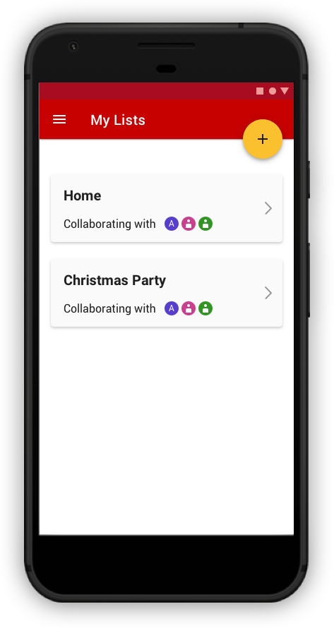

Shopping List
The app allows easy collaboration between people to create shopping lists and people can create list based on occasion, needs, etc.
It also supports creating different shopping lists according to the store that the user would be visiting, provides product recommendation based on user’s profile and previous shopping history.
Users can also collaborate with other people to create/edit the list. This is especially helpful for a household or roommates living together with every member having different needs.
People can also create multiple shopping lists with multiple people and mark any product as favorite.
AR Navigation
The app supports in-store navigation using AR technology. It will pick the quickest path for shopping and integrate it with the shopping list to show product location, thus, providing the ability to navigate to an item in the shopping list. It will also show the placement of a product on a rack.
It will also provide a 2D map to have bird's-eye view of user’s position. This is especially helpful in large stores where users often get lost while finding a product or look for a product endlessly without having any clue about the size of the store or the placement of the product.


Product Information
The user can scan the barcode of a product to see product information like product price, reviews, ratings, discounts, etc. The app will show them personalized information based on their profile, for example, calorie content, nutritional value, food allergies. It will also give them product reviews and ratings with highlighted reviews and ratings from a friend
The app will also provide information on “how to use a product” in the form of maybe videos, recipes, pictures, description, etc.
Mobile Checkout
The app provides ‘Add to cart’ option to directly purchase items by scanning the barcode and paying for it using saved cards on the app. Users can split the payment between different cards, will get an e-receipt directly on the email and can also request payment from other people. This is helpful when friends go to shop together and one of them ends up paying for everyone and later on has to ask for payment from everyone.
However, the mobile checkout is convenient for products that don’t need weight measurement but for products like fruits, vegetables, etc that do need weight measurement, weighing scale available in the stores would be needed. In the future, the app would need to address this issue.

The How?
Process

Image 1. Contextual Design Process.
We started the research with interviewing the stakeholder, conducting competitor analysis, and reviewing Karen Holtzblatt’s ‘The Easy Shop’ Project as part of the background research, followed by conducting 9 contextual inquiries. We analyzed the results during the interpretation session and generated affinity diagram utilizing the information gathered during contextual inquiries. Later, we created sequence models, identity models and day in the life model using the data collected and consolidated them to produce product concepts.
Phase 1: Background Research
Competitor Analysis
We reviewed Costco and Walmart iOS apps as part of the background research and compared the findings against the Target iOS app. We found out the following helpful details:
Both Costco and Walmart iOS apps are designed to shop online and use other additional services like pharmacy.
They are designed for people in all age groups and are straightforward to use as they utilize the same conceptual models followed by other e-commerce stores.
The Costco app icon is not distinctive and gets lost among other app icons in the drawer. It is rated 2.6 on the Apple App Store and 4.1 on the Google Play Store. Although the Costco app has a clean UI, a lot of improvements can be done when it comes to UX.
The unique icon and colour of Walmart makes sure that it stands out from the rest of the apps in the app drawer. It is rated 4.7 on the Apple App Store and 4.4 on the Google Play Store. Even though the Walmart app has a consistent colour scheme, the design is not aesthetically pleasing.
Analyzing the Target App
The pros and cons of some of the features in the Target iOS app have been discussed below.

Image 2. Screenshots of the Target App and the pros and cons of some of the features in the app.
The app has a feature to make a shopping list, however, the experience is incomplete and flawed:
The list is sharable but not collaborative.
Users cannot add quantity to the list items.
There are similarities between List and Cart which tends to create a lot of confusion among the users.
User can only make one list and no record is maintained for the previous list(s).
Users cannot move items from shopping list to cart so as to buy it online.
Literature Review- Karen Holtzblatt’s ‘The Easy Shop’ Project
I reviewed Karen’s ‘The Easy Shop’ project intended at ‘Supporting Grocery Shopping’. I analyzed the pluses and minuses in the work, which helped us in getting a better understanding of our project. There were similarities with our project focus. However...
Pluses:
The team researched the planning and collaboration that takes place before visiting a store.
Interviews were conducted before, during, and after grocery shopping.
Minuses:
Karen’s team didn’t elaborate on the reason behind focusing on the experience of only dual-income families.
They didn’t mention if different income categories were considered and what percentage of people were interviewed from each category.
Not a lot of details were provided about the after grocery shopping experience, which can influence the next shopping experience of the user.
Stakeholder Interview- Interviewing the Target Store Manager
My teammate and I interviewed the Target Store Manager who has been working at Target for around 10 years with the aim to understand the business needs.
Interview session: 20 minutes
Interview type: Semi-structured Interview
The Target Store Manager shows us the app (as seen in Image 3) they use to manage inventory and find product details. The app, according to him, is easy to use. The screen shown in Image 3 provides the item information on scanning the product and gives details like product price and the number of items in the store. However, we found out that the app does not provide the information on where exactly is the item located in the store to help the staff members in assisting the customers better, in addition to having various other UX flaws.
“We want to leverage current technology to make shopping more effective and easier for our customers.”
-Target Store Manager
Image 3. The Target Inventory Management and In-store App.
Phase 2: Contextual Inquiry
We conducted 9 contextual inquiries. Given below is the demographic information about our 9 interviewees, who belonged in the age group of 23-47 years. There were 7 females and 2 males out of which 7 were single and 2 were married.


Although the project focused on understanding the current experience to improve the in-store shopping experience at Target, our approach towards conducting the contextual inquiries had taken various factors into account as outlined below in the interview focus.

Image 4. Project and Interview Focus
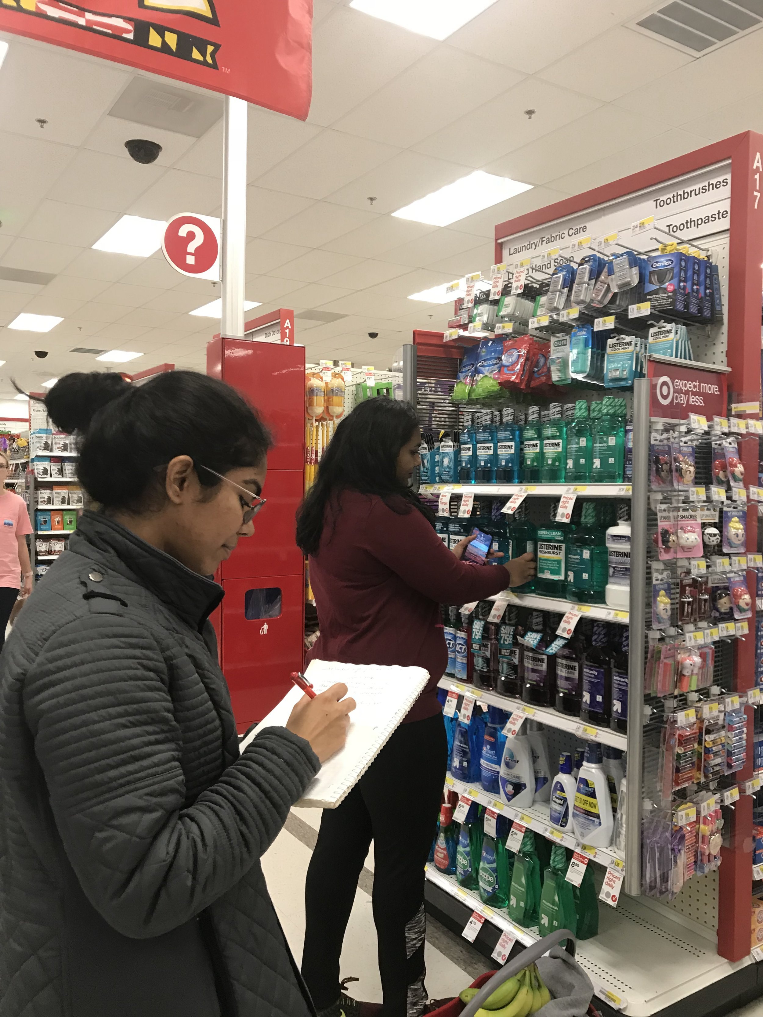
Image 5. A contextual inquiry in progress with an interviewee at Target.
Phase 3: Interpretation Session
Interpretation session is an immersive experience to provide a context for the team to understand the data gathered from a contextual interview in depth. In an interpretation session, the interviewer narrates their observation about the user while other teammates take notes and draw Contextual Design models (as discussed below). This helps the discussion to spark design ideas and interpret the “Whys” behind the user behavior.

Image 6. A screenshot of the interview notes taken in one of the interpretation session.
Phase 4: Affinity Diagram
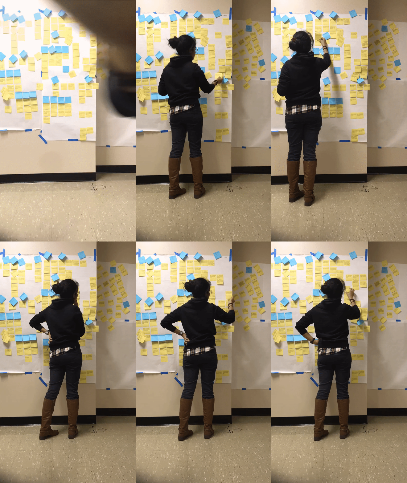
We generated affinity diagram using the data collected through the contextual interviews. The raw notes about the interviewee’s observation and user’s behavior from the interpretation session are in yellow colored sticky notes. After finding the common themes in several yellow notes, they are grouped together and assigned a blue label which conveys the common theme in the yellow notes underneath it. Similarly, various blue sticky notes are grouped together and placed under a pink note, which denotes the common theme originated out of the blue (and eventually yellow) notes. The common themes in pink notes are grouped together to form a green note which conveys the high-level findings originated out of the notes underneath it.
Before
After
Phase 5: Model Consolidation
After creating sequence model, identity model and day in the life model for the individual contextual interviews conducted , we analyzed them to find out the common user behaviors in them and created a consolidated sequence model, identity model and day in the life model.
Sequence Model
A sequence model shows the series of steps that users follow in accomplishing a task. The consolidated sequence model generated from combining the common themes identified in the individual sequence model (created after each interview) is shown below.
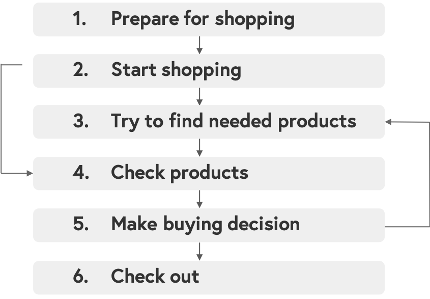
Image 7. Consolidated Sequence Model showing the common steps that shoppers followed to accomplish the task- to buy a product at Target.
Identity Model
Identity Model visually represents the different observations about the user in terms of sources of pride, self-esteem, and value that emerged during the contextual interview. The consolidated identity model created after identifying the common identity elements in the user is shown below.
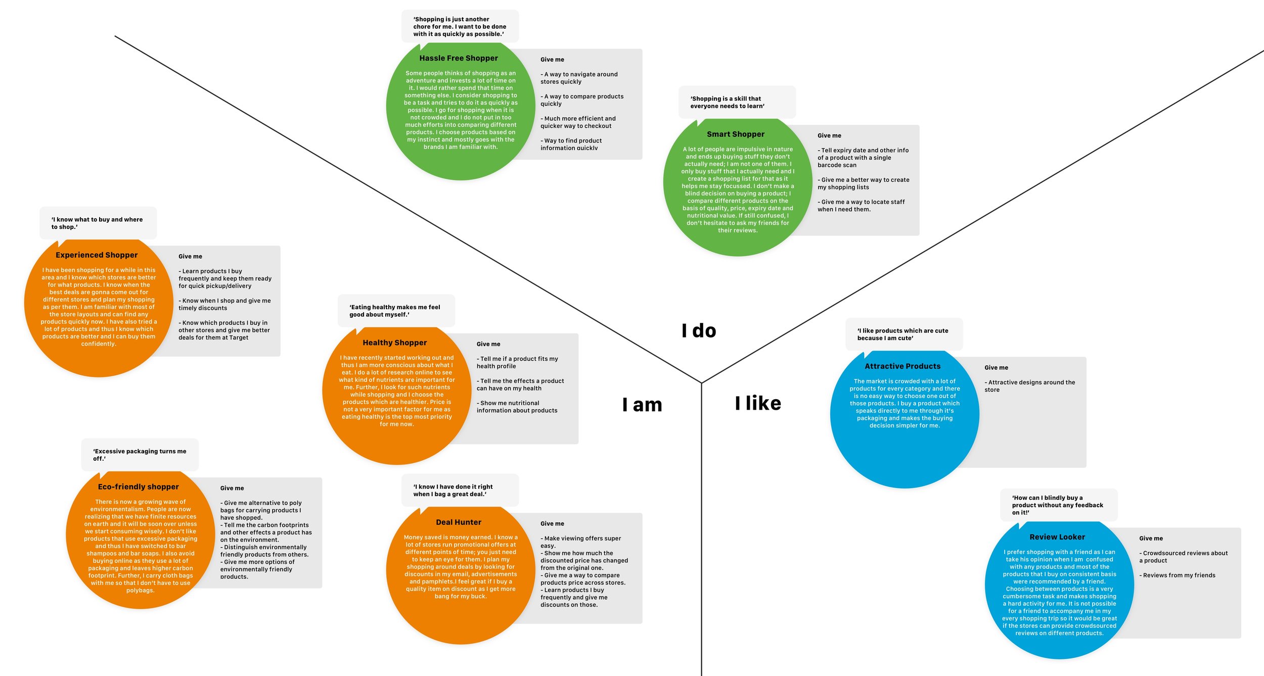
Image 8. Consolidated Identity Model (click on the image to zoom in) showing the different observations of sources of pride, self-esteem, and value that emerged during the interview. The different identity elements relevant to the project focus have been depicted here. The “I Do” element conveys the things that they do and have been noted form the observations during the contextual interview. They are smart and hassle-free shoppers. The “I am” represents identity elements that reveal an overarching approach of the personality, as conveyed by the identity elements- Experienced Shopper, Healthy Shopper, Eco-friendly Shopper, and Deal Hunter. The “I like” represents what is desired by the shoppers- Attractive Products and Reviews.
Day in the Life Model
A day in the life model is the visual representation of the different places in the user’s life, the activities undertaken in that place, the devices which support the activities, and the content accessed there as part of the entire process of accomplishing their task, which is purchasing a product in our project.
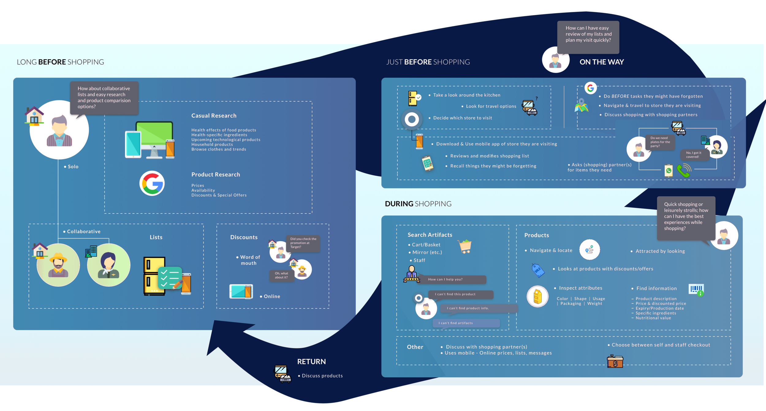
Image 9. Consolidated day in the life model (click on the image to zoom in) showing the different places in the user’s life, the activities undertaken in that place, the devices which support the activities, and the content accessed there. We observed the small, focused activities which occur throughout the day in different places, at different times, on different platforms, which work together to get larger activities like shopping done. For example, using Google to research about the product (prices, availability, discounts and special offers), making a collaborative shopping list with friends and family by using mobile phones or using a physical list on the refrigerator of a household.
High-level Findings
The high-level findings about the user behavior we gathered from the interviews were:
“I want to find products easily”.
“I decide to buy a product” when:
“I find needed information”.
“I find it good for my health”.
“It's environmentally friendly”.
“I have used it before or I trust the brand”.
“I know it's easy to use and it suits me”.
“Saving money while shopping is a priority for me”.
“I want to check out conveniently and quickly”.
Phase 6: Visioning
In Contextual Design, the Wall Walk is the first step for coming up with design ideas for the product concepts. In the Wall Walk, participants, whether they were involved in data collection (contextual inquiries) and consolidation or not, immerse themselves in the data (affinity diagrams) in preparation for design. The goal is to help designers link design ideas to the data—the real structure and challenges of the users’ world. We selected the top “hot ideas” and came up with various design ideas for the product as shown below.
The user should be able to create shopping list, collaborate with others on the list, mark any item as “favourite”, scan barcode to add item, and manage list across different stores.
The user should be able to create multiple shopping lists depending on the store they will be visiting and get product recommendations to be added to the shopping list based on their profile and previous shopping history.
The new product can use AR technology to navigate around the store and find a product quickly. The user should be able to see product information by scanning the barcode and directly checkout using their mobile phones.
Phase 7: Product Concepts
We formulated these designs and created sketches for our product- a mobile app that uses AR technology to improve the shopping experience of the user.
Shopping List. The app will allow easy collaboration between people to create shopping lists. It will support creating different shopping lists for multiple stores, provide product recommendation based on profile and previous shopping history, create multiple shopping lists with multiple people, mark certain products as “Favourite”.
Product Information. The app will be able to scan the barcode of a product (using the mobile phone’s camera) to give product information as the result. User will be able to see basic information of the product like price, reviews, ratings, discounts, etc. They will also receive personalized information (calorie content, nutritional value, food allergies) based on their profile. They can see product reviews and ratings with highlighted reviews and ratings from a friend (so as to distinguish between the public review and rating and that by a friend). Additionally, the app will also provide information on “how to use a product” (through videos, recipes, pictures, description, etc.) to help understand if it’s something usable for them and make better buying decisions.
AR Navigation. The app will have the feature to navigate inside the store using AR technology. It will pick the quickest path for shopping and integrate it with the shopping list to show the product location inside the store. It will have the ability to navigate to an item as per the shopping list and show placement of a product on a rack. It will also provide a 2D map to have bird's-eye view of user’s position.
Mobile Checkout. The stores will have modified shopping carts with cloth/poly bags in it to save user’s time of putting the items in the bag at the end of shopping. The app will have ‘Add to cart’ option in order to directly purchase it by scanning the product barcode and paying for it using saved cards on the app. They can also split the payment between different cards, if needed. Users will get an e-receipt directly on the email and will have the option to request other people for payments during checkout. In order to weight items such as bananas, potatoes, etc. during checkout they can make use of an external weighing scale located inside the store.
Challenges
Since we wanted to make sure we include different kind of users in the research process, user recruitment was a challenge for us in this project. However, we were able to tackle it with the help of a survey. We designed it using Qualtrics and sent it out in our department, which helped us tremendously.
Building the affinity diagram on such a huge scale was a challenge because of the dissimilar themes emerging out of the sticky notes. Grouping them together was also difficult because one sticky note conveys one “Why” behind user’s behavior, which could be interpreted in different ways, and therefore, could be associated with two different themes. Thus, through multiple iterations we became better at understanding the deeper meaning behind the user’s behavior, analyzing the themes in the notes and grouping them accordingly.
Key Takeaways
I learned not only a new technique, contextual inquiry, to collect user behavior but also how to utilize it to generate product concepts.
Working in a team taught me how to manage the 3 valuable resources for the success of a project- people, time, and money.
Next Steps
If I had more time, I would have loved to work on the following:
Utilizing the research findings and product concepts to create a high-fidelity prototype.
Testing the prototype with the users to assess how helpful it is to the users and what design areas need further improvement.
