Designing Color Universal Visualization Tool
As a UI/UX Design Intern at the Center for Advanced Transportation Technology Laboratory in 2018, I designed a visualization tool for the Federal Railroad Administration. The tool solved the problem for Analysts at FRA of manually understanding the data using only PDFs and MS Excel. It improved the process by 92% and helped them in making an informed decision for improving the safety of the railroads. The design also aimed at being accessible to the population who are color-blind.
My Role: User Research, User Interface Design, Prototyping and Evaluation
Duration: 6 weeks
Tools Used: Adobe Illustrator, Adobe XD, MS Excel
Techniques Used: Users Interviews, User Persona, User Journey Mapping, Sketching, Wireframes, User Flow Diagram, High-fidelity Prototyping, Quantitative Data Analysis, Usability Testing
The Who and The Why?
Federal Railroad Administration Analysts always had to refer to a PDF document to understand the dataset in an Excel sheet, which consisted of information on a railroad crossing and the incidents occurred at that crossing. The dataset had large number of columns filled with numbers, short forms, and unique dataset IDs which made the cross referencing between the PDF and the Excel sheet difficult. It was problematic to understand the information this way. Therefore, the stakeholders wanted to develop a solution that could not only help the analysts in studying the information in a better way but also aid them in making an informed decision for improving the safety of the railroads.
The What?
To help the Analysts in building meaningful graphs and getting helpful insights from the data in a quicker way, I decided to design an interactive visualization tool that would aid them in making an informed decision about the safety of the railroads. On testing the tool later, I found that the tool improved their process by 92%.
Key Features
Color universal
The prototype is accessible for people with Protanopia and Deuteranopia color blindness. Color contrast helps them differentiate between the two colors and the design ensures that both blue and purple colors are not mixed together and kept on the same screen. The design is minimal for better accessibility and easier comprehension. It ensures visibility of system status, blue and purple each denote two different datasets - railroad crossings and incidents.

Interactive visualizations and trend analysis
Provides interactive visualizations and trend analysis for both crossings and incidents dataset for the selected time period on the sidebar, and the user can select a shorter time span using the time slider to do the trend analysis. The trend line is interactive and gives the information on number of crossings and incidents in a particular year on a mouse hover. The map is interactive as well and a user can click on any of them to get state level details.

Detailed report for informed decision making
This is the report for a particular incident. The user can click on 'Look at Impact' to create a radius around the location of incident and do additional analysis (denoted by icons) like- User Delayed Cost, Bottleneck Ranking, and Trend Map. The page also provides information on Weather, Temperature, Visibility, etc. at the time of incident. The 'Crossing', 'Train', and 'Vehicle' tabs provide information for the crossing at which the incident took place, the train and the vehicle involved in the incident.
The How?
Design Process
My Design Process included defining the problem, ideating the solutions to come up with a prototype and finally analyzing the prototype to assess the drawbacks of the design. After evaluating the prototype, I went back to brainstorming ideas and redesigned it.

Phase 1: Empathize
User Interviews
I started with finding out the parameters necessary to be included in the tool for the analysts by conducting semi-structured qualitative in-person interview with two users. This helped me in understanding the problem and their needs better. The key takeaways were that the Analysts always had to analyze two different kind of datasets (which date back to 1975 until present)- Crossings and Incidents. The Crossings dataset includes all the information on the crossings (Crossing ID, Railroad Name, Street Name, County Name, etc.) in USA and Incidents dataset consists of information on the incident occurred at a crossing (Vehicle Information, Train Information, Crossing ID, etc.). I also asked them to show me how they analyze the data now to help me gain a better understanding of the issues and the process. During the interview, I found out that it takes them an average of 3 hours on any given day to analyze the dataset.
Data Analysis
The interviews were followed by analyzing the dataset on railroad crossings and incidents in order to find how they could be utilized to improve the safety of the railroads. Given below is a snippet of the dataset I analyzed using MS Excel. The dataset consisted of 80 features, with vague railroad jargons which were difficult to understand. The key takeaways were that the datasets consisted of information on crossing name, location, geographical coordinates, location of the incident occurred, various conditions during which the incident occurred, such as, road condition, temperature, visibility, and weather conditions.
After analyzing the dataset using MS Excel, I grouped them together according to the pattern observed in them. Having a better understanding of the dataset helped me in the defining the problem. I wanted to address the problem of analyzing the data in two different file formats- PDF and .xls and having to refer them back and forth to gain insights.
Phase 2: Define
The findings gathered from user interviews and data analysis helped me to define the problem through user persona and journey map. User persona provided me with a deeper understanding of the user behavior and motivation. It helped me to gauge "Why would the user need this tool?" and "How would it fit into his daily life?". In doing so, I learned that the design should help the user analyze the datasets better and should have all the information about the crossing and the incidents occurred at that crossing at a single place. I learned that the tool would need to provide quick, meaningful, and interactive visualizations.
After creating the user persona, I worked on creating the user journey map to visualize their end-to-end experience of analyzing the datasets and emotional journey while doing the tasks. I wanted to identify the pain points and the various use cases in the process, and address those through my design solution.
Michael's journey of analyzing the data and creating visualizations on a regular day.
MAJOR LEARNINGS: By creating a User Journey Map, I learned "What are the problems, frustrations, and pain points encountered by him due to the absence of a tool?" and "What necessary details should be included in the new tool?".
Phase 3: Ideate
The next step involved ideating to come up with design solutions. I started with designing the icons to represent a crossing and an incident.
Brainstorming: Sketching Designs and User Flow Diagram
After deciding on an icon to represent a crossing and an incident on a map, I sketched out few screens of a tool that could help the Analysts in analyzing and visualizing the data in an efficient way and help them gain a better understanding of the data for informed decision making.
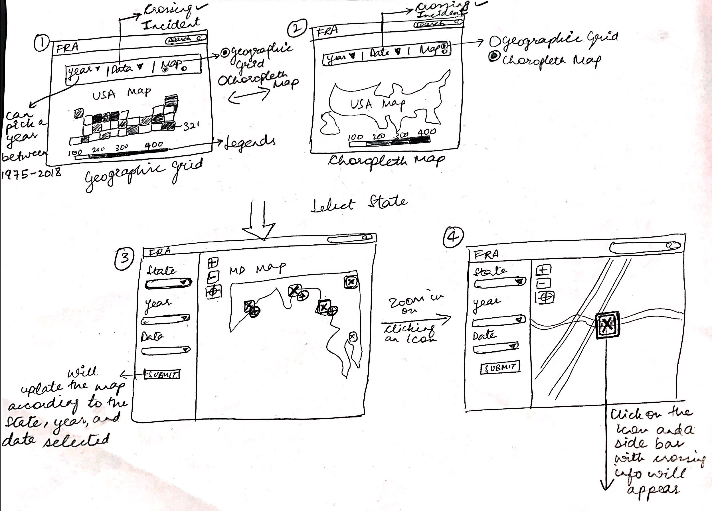
Sketch 1
When the user would have selected to analyze the crossing information first, he/she can click on a state in the National level map and go on to select a crossing from the state level map.
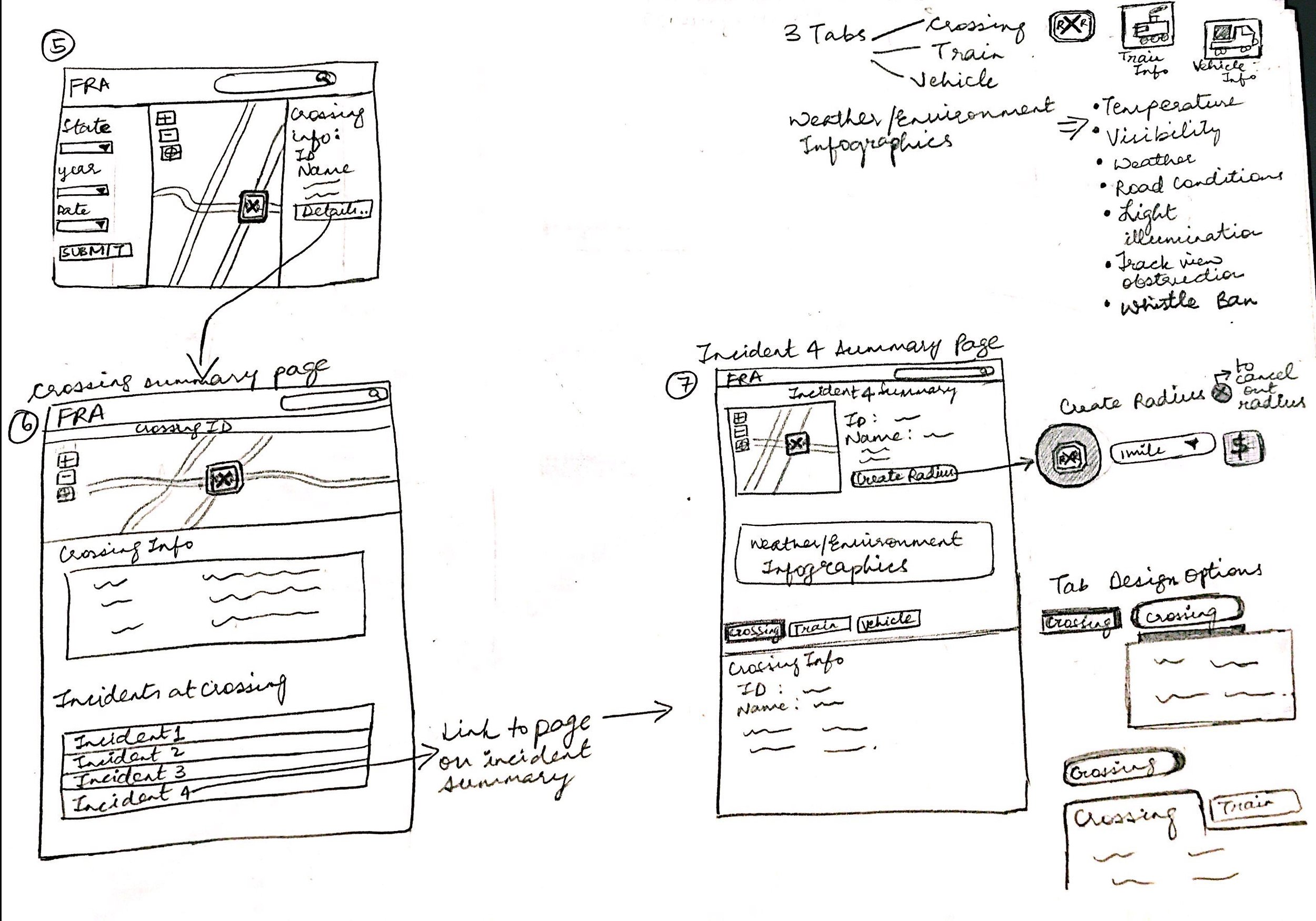
Sketch 2
When the user clicks on 'Details..' button to see more information on the crossing and is taken to the Crossing Summary Page. From here, the user can select any incident to go to the Incident Summary Page which would have details like the type of incident, crossing and train information, the information on the vehicle involved in the incident, etc.
There would be 3 tabs containing the information on- Crossing, Train, and Vehicle. There will also be an option to create a radius around a crossing to analyze it.
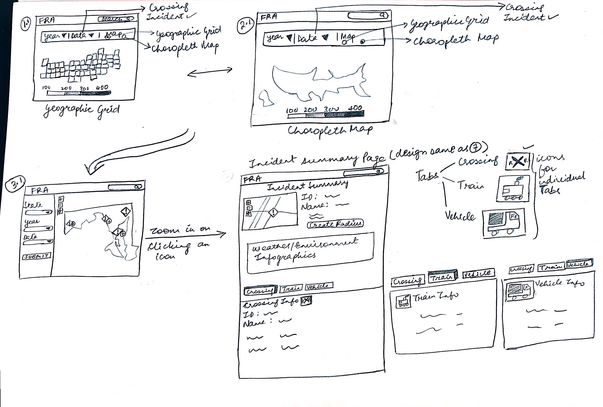
Sketch 3
Instead of first selecting to analyze the crossing information, the user can directly pick to analyze the incident from the screen 1 (National map). The user would then have to select a state to analyze and then click on any particular incident to get a summary of that incident.
To understand the user flow through the designs and validate it, I created a user flow diagram, as shown below.
User Flow Diagram. Validating the flow of the user through various screens
Phase 4: Prototype
After creating the wireframes and user flow, I created the designs of the tool using Adobe Illustrator and created a high-fidelity prototype using Adobe XD. A video of the prototype is provided below for reference.
High-fidelity prototype of the initial design.
Phase 5: Test and Redesign
After testing the prototype with the two users and finding the areas to be improved, I reworked on the designs. The users were asked to perform 5 tasks with the prototype of the tool in a moderated in-person setup. Since the stakeholders wanted the designs to have shades of blues and purples, I ensured that the prototype would be accessible for people with color blindness while reworking on the designs. I checked for Protanopia, Deuteranopia, Tritanopia, Achromatopia color blindness while making the color choices, which helped me in making an informed design decision using Adobe Illustrator color proofing feature and Colorblinding Chrome extension. I picked the shades of color as per how it would be the most accessible to them and picked lighter and darker shades to help them to be able to differentiate between the two colors. I ensured that both blue and purple colors are not mixed together and kept on the same screen, and hence, I have kept them on different screens. I wanted to keep the design minimal for better accessibility and easier comprehension. To also provide visibility of system status, blue and purple have been used to denote two different datasets- railroad crossings and incidents.
The new prototype was tested again and this time on comparing the results to the time when they had to analyze the data manually initially, it was found that the tool brought down the time spent to make an inference and improved their process by 92%.
Here is a click through video of the final high-fidelity prototype. Please note that some of the visualizations contain dummy data for the purpose of prototyping.
Challenges
Analyzing the dataset was a challenge since I had never analyzed such a large dataset with complex features. Thus, I referred the PDF manually to understand the features, and grouped similar data points together to extract patterns.
Selecting the right colors and color palette was a challenge because of the limitations set by the stakeholders for using blues and purples in the tool. So I ensured that the prototype would be accessible for people with color blindness while also making sure both the shades are not put on the same screen and associated them with two different datasets to provide visibility of system status.
Getting the user flow right was a challenge because of the overlap between railroad and incident datasets. Therefore, creating user flow diagram and following an agile iterative design process was helpful.
Key Takeaways
Doing this project helped me to understand how to create a universal design and taking into account the accessible color palette.
Through this internship, I got an opportunity to work with a team of creative fellow UI/UX Designers, Developers, Project Managers, Directors and business clients in a corporate work environment.
This internship provided me with a platform to solve a real-world problem which impacted millions of people and also improve their lives.
I learned how to create beautiful and meaningful designs in shorter sprints as part of an agile development process.
Brainstorming with the developers on the design solutions provided me with helpful insights into the back-end technology integration constraints as well as the feasible components in my design for the developers.
Next Steps
If I had more time, I would have loved to do the following:
Testing the prototype with people with color-blindness. I made use of Adobe Illustrator color proofing and Colorblinding Chrome extension to assess if my designs are accessible for people with color blindness, however, only when it’s tested with people it could be validated for its efficiency.
Providing deeper analysis to the user based on various dependent factors, for example, analysis of the impact of a railroad incident based on time of day and weather conditions.


