Traveling through the Lens of a Designer
Designers function in a way that they are constantly critical about the design and usability of everyday things. It was the holiday season and I was traveling to California and India, and would like to critique on the usability of some of the things that I encountered during my recent travel experience.
As you can see below, the image on the left shows a single display screen with the status and location of all the elevators on the floor, providing all the relevant information at one place and not having to look at 8 different places instead. The second image shows a list of all the car rental services on each floor inside the elevator, helping people subconsciously make a conscious and an informed choice.
The image below is a mobile phone screenshot of the email containing the flight information that I always receive on my iOS Gmail app. All the relevant and important information is clearly laid out and also gives a nice graphic of the city I am traveling to, to keep things interesting.
The images shown below indicate the handles on both the sides to lift the toilet seat and the cover. This not only makes it convenient but also ensures hygiene.
The images below show that the headrest on a seat is placed so high, that a female of average height 5ft3.5in in the United States won’t be able to reach it. It might suit perfectly to a tall male or female but let’s consider all the audience which are left out because of bad design- a short adult or kids or teens. Moreover, the extension on the headrest takes it even higher and makes it unsuitable for so many people without allowing it to be pull downwards for a short person like me. Instead, the headrest should be flexible and extensible enough to move it in both the directions- upward and downward.
The in-flight entertainment screen now provides touchscreen options to call the flight attendant or turn on the reading light allowing people to sit comfortably in their seats and operate those, instead of having to get up to access those buttons on the top of your head, as in the earlier days. However, accessing these options was not intuitive and the entertainment screen also did not provide any information on how to access it. One would not expect to find these options with the entertainment screen. I struggled for about half an hour with the light on during take off to find the button to turn it off. These options shouldn’t be buried inside a menu and should be instead in the front beneath the entertainment screen.
Flights boast about the legroom that they offer and then end up designing something like this. Having the base of the seat in between not only made me uncomfortable all throughout my really long flight (almost 20 hours long!) but it was also inconvenient. It prevented me from keeping my laptop bag at my reach.
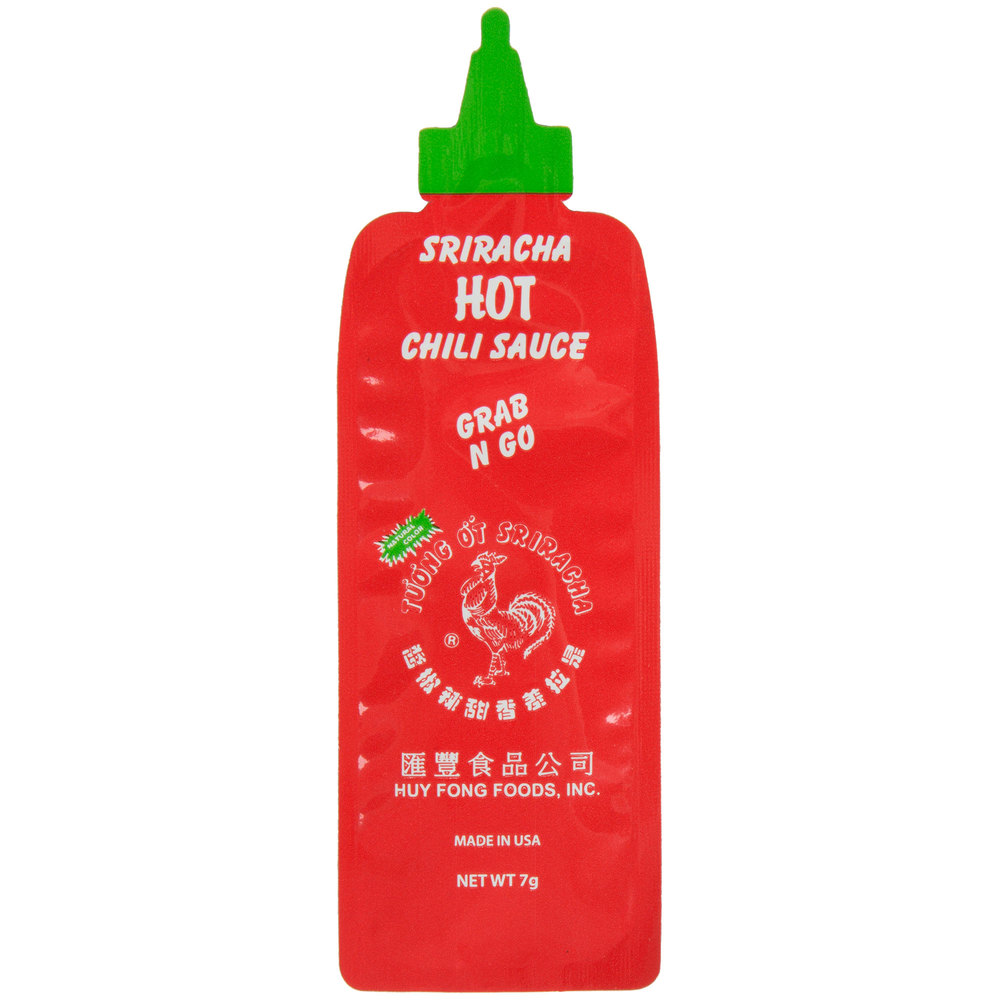
Let’s talk about convenience now! These portable packets have made our lives so much easier. The Heinz Tomato Ketchup pack not only allows the customers to squeeze it but also dip their fries or chips into it. The Land Lakes Butter pack guides the customers appropriately about which end to open it from. The Sriracha Grab N Go pack resonates with the brand identity due to its packaging and is also very convenient. Perfect for both business and customers! What say?
Image Courtesy: http://fortune.com/2015/04/02/heinz-ketchup/
Image Courtesy: https://www.webstaurantstore.com/huy-fong-7-gram-sriracha-hot-chili-sauce-packets-case/125PC639003.html


